Design Trends Worth Your Attention (and the Ones to Skip)
Not every design trend is worth chasing. Some are pure aesthetics that look good in a portfolio but slow down real websites and confuse real customers. The trends that matter in 2026 share one thing in common: they make it easier for a visitor to understand what you offer and take action, faster.
If you're planning a redesign or building a website for the first time, here's what's actually worth adopting — and why each one has staying power beyond a single design cycle.
Mobile-First Layouts Are No Longer Optional
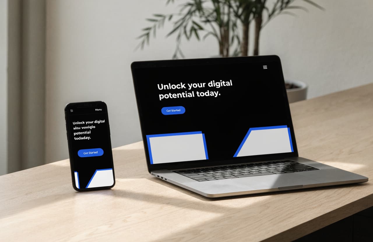
Most visitors are going to land on your site from a phone, not a desktop. Designing for that screen first — rather than building a desktop layout and shrinking it down — means buttons are easy to tap, text is readable without zooming, and the most important information appears before anyone has to scroll far.
It also forces discipline. When your first draft has to fit a small screen, you naturally cut the clutter and keep only what matters, which tends to make the desktop version stronger too.
Bold Simplicity Beats Cluttered Pages
A page packed with five different offers, three sliders, and a dozen calls to action doesn't give visitors more options — it gives them decision fatigue. The strongest sites in 2026 lean into restraint: one clear headline, one primary action, and enough white space for the eye to rest.
This doesn't mean boring. Bold typography, confident color use, and a single striking image can make a simple layout feel far more memorable than a page trying to say everything at once.
Four Trends With Staying Power
Mobile-First, Not Mobile-Adjacent
Layouts are designed for the phone screen first, then scaled up — not squeezed down from a desktop design as an afterthought.
Bold, Uncluttered Layouts
One clear message per section, generous white space, and a single obvious next step beat pages crammed with competing offers.
Speed as a Design Feature
Heavy animations and oversized images are giving way to fast-loading pages, because every extra second of load time costs visitors.
Accessible by Default
Higher-contrast text, larger tap targets, and readable fonts are becoming standard, not an extra step tacked on at the end.
Trends Should Serve the Customer, Not the Other Way Around
It's tempting to chase every new design pattern that shows up on social media, but the trends that last are the ones that make a site faster, clearer, and easier to use. If a trend adds complexity without adding clarity for your customer, it's safe to skip.
Visit MiSitioWebs.com to launch a mobile-first, fast-loading website built around these exact principles, with no design experience required.